
One Technologies - Responsive Experience Redesign
Redesigned a desktop-only experience into a fully responsive product across mobile and desktop. The goal was to create a mobile experience from scratch while improving an existing desktop flow that had usability issues.
ROLE
PROBLEM
The project came with a few key challenges that needed to be solved to create a seamless, scalable experience across devices:
No existing mobile experience
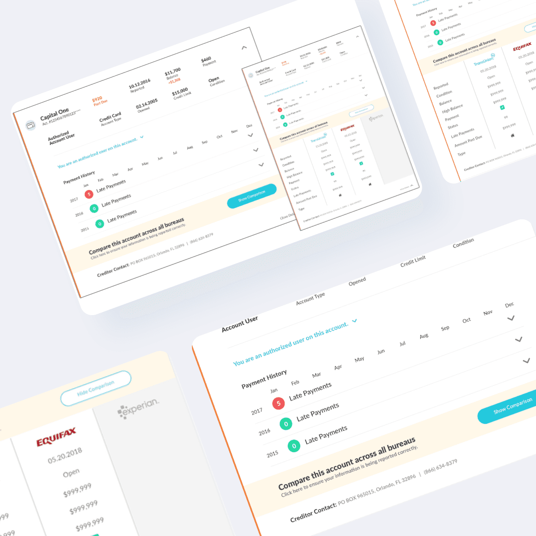
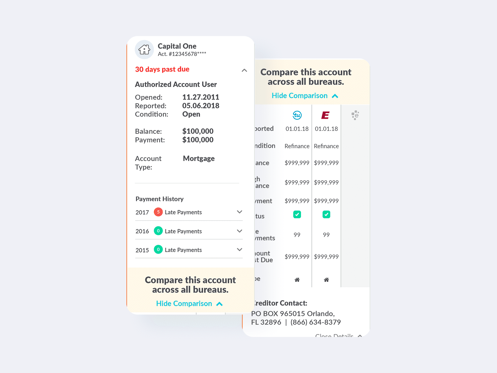
Desktop experience relied heavily on modals, creating friction
Needed a scalable solution that worked across multiple screen sizes
Maintain visual consistency across the broader product ecosystem
Going Mobile First
Mobile-First Strategy
Started by designing a new mobile experience from the ground up, focusing on simplicity, clarity, and ease of use.
Interaction Redesign
Replaced modal-heavy desktop interactions with expandable sections to create a smoother, more intuitive experience.
Responsive Design
Scaled the selected mobile patterns into a complementary desktop experience, ensuring consistency while optimizing for larger screens.
Collaboration
Worked closely with developers to account for breakpoints, screen sizes, and implementation constraints.

Well Rounded UX Solution
Delivered a flexible, responsive design system that:
Introduced a clean, user-friendly mobile experience
Improved desktop usability with more intuitive interactions
Replaced disruptive modals with expandable content sections
Created reusable patterns for charts and data displays across multiple pages

The UX Impact
The redesign established a consistent, scalable experience across devices, improved usability, and introduced reusable design patterns that enhanced efficiency across the product.